How To Implement An Animated Circle Loading Screen with React Native Reanimated 2
How To Implement An Animated Circle Loading Screen with React Native Reanimated 2
Recently I discovered a cool loading animation while watching a TV show online. Until the stream started, an animation consisting of multiple rotating circles is shown. I liked it that much that I decided to rebuild it using React Native. This post is a guide on how to implement this loading screen and also provides tips for similar animations.
For implementing the animations the React Native Reanimated 2 library (version 2.0.0) is used. The animation runs on the UI thread of the application with 60 frames per second. Apart from Reanimated 2 no other additional libraries are needed. TypeScript is used for the implementation.
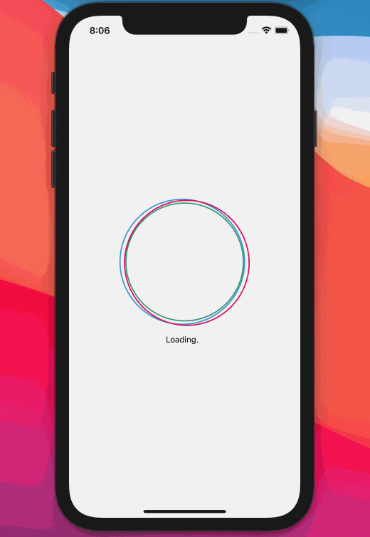
Here is the preview what it will look like in the end:
Layout and Circle Component
If you have a close look at the animation, you'll notice that it consists of three circles.
- The green inner circle is included in the other two circles. The inner circle is static and not rotating.
- The moving red outer circle is slightly bigger than the inner green circle. Also it is always touching (but never crossing) the inner circle while moving around the inner circle. This effect is achieved by rotating the outer circle around the center of the inner circle. The rotation anchor point is the center point of the inner circle.
- The second blue outer circle behaves in the same way as the red circle. The only difference is that it has an offset in the rotation angle, so that it is always a bit further than the red one.
First, the CircleAnimation component is created which is the container for the three circles. Since the circles will be positioned 'absolute' in the container, the height and width of the CircleAnimation component are set explicitly, so it does not collapse to a height and width of zero. The height is calculated by the radius of the biggest circle and by the highest and lowest possible position of the circle.
CIRCLE_RADIUS defines the radius of the inner circle. ADDITIONAL_RADIUS will be added to the radiuses of the outer two circles.
const CIRCLE_RADIUS = 100;
const CIRCLE_BORDER_WITH = 2;
const ADDITIONAL_RADIUS = 6;

const styles = StyleSheet.create({
    circleContainer: {
        justifyContent: 'center',
        alignItems: 'center',
        height: ((CIRCLE_RADIUS + ADDITIONAL_RADIUS) * 2) + (ADDITIONAL_RADIUS * 2) - (CIRCLE_BORDER_WITH * 2),
        width: '100%',
    }
});

const CircleAnimation = () => {
    return (
        <View style={styles.circleContainer}>
            <Circle borderColor={'rgb(50, 150, 110)'} />
            <Circle borderColor={'rgb(50, 150, 200)'} additionalRadius={ADDITIONAL_RADIUS} />
            <Circle borderColor={'rgb(220, 0, 90)'} additionalRadius={ADDITIONAL_RADIUS} />
        </View>
    );
};
The Circle component consists of a single circular view which is transparent and has a colored border.
In the first step the component takes two props only: the border color and an optional additional radius. The additional radius prop is used to modify the radius for the two outer bigger circles.
const styles = StyleSheet.create({
    circle: {
        position: 'absolute',
        width: CIRCLE_RADIUS * 2,
        height: CIRCLE_RADIUS * 2,
        borderRadius: CIRCLE_RADIUS,
        backgroundColor: 'rgba(0, 0, 0, 0)',
        borderWidth: CIRCLE_BORDER_WITH,
        borderColor: '#F00',
    }
});

interface CircleProps {
    borderColor: string,
    additionalRadius?: number,
}

const Circle: React.FC<CircleProps> = (props) => {
    const additionalRadius = props.additionalRadius ? props.additionalRadius : 0;
    const radius = CIRCLE_RADIUS + additionalRadius;

    return (
        <View style={[
            styles.circle,
            {
                height: radius * 2,
                width: radius * 2,
                borderRadius: radius,
                borderColor: props.borderColor
            },
        ]}></View>
    );
};
The three circles are now drawn on top of each other with different colors and sizes:

Bringing life to the circles: Creating the animation
In the next step we bring in some motion using React Native Reanimated 2.
First a Shared Value "rotation" is created. The Shared Value is similar to the concept of Animated.Values from the Animated API. The attribute Shared means that this value is shared between the UI and the JS thread which allows the animation to be driven in the native thread.
Since the two circles need the same time for one animation cycle (one rotation), declaring only one Shared Value is enough for driving the animations. The Shared Value will be animated from value 0 to 1 and is then interpolated to degree/radians for rotating the two outer circles.
const rotation = useSharedValue(0);The two outer circles shall rotate endlessly. The animation helper withRepeat will take care of that. It will repeat the declared withTiming animation endlessly which drives the rotation.value from 0 to 1 in 1.5 seconds. The Easing has to be set to Easing.linear:
rotation.value = withRepeat(
    withTiming(1, // toValue: 1
        { duration: 1500, easing: Easing.linear }
    ),
    -1, // inifinite
    false); // do not reverse
Putting it all together in the CircleAnimation component it looks like this. The animation is started in the useEffect Hook and also canceled:
const CircleAnimation = () => {
    const rotation = useSharedValue(0);

    const startAnimation = () => {
        rotation.value = 0;
        rotation.value = withRepeat(
            withTiming(1, // toValue: 1
                { duration: 1500, easing: Easing.linear }
            ),
            -1, // inifinite
            false); // do not reverse
    };

    useEffect(() => {
        startAnimation();
        return () => {
            cancelAnimation(rotation);
        };
    }, []);

    return (
        <View style={styles.circleContainer}>
            <Circle borderColor={'rgb(50, 150, 110)'} />
            <Circle borderColor={'rgb(50, 150, 200)'} additionalRadius={ADDITIONAL_RADIUS} rotation={rotation} />
            <Circle borderColor={'rgb(220, 0, 90)'} additionalRadius={ADDITIONAL_RADIUS} rotation={rotation} />
        </View>
    );
};
Passing a Shared Value as a prop to a child component
As shown in the snippet above the Shared Value rotation is passed down as a prop from the CircleAnimation component to the Circle component. In the Circle component the value is interpolated to a rotation transformation which is then used to style the Circle's View.
It's important to notice that the whole Shared Value object needs to be passed as a prop and not only the Shared Values .value property. The Shared Value object serves as reference to the shared data between the UI and JS thread. Driving the animation in the parent CircleAnimation component will update the Shared Value's .value property rotation.value. If the rotation.value would be passed as a prop, it wouldn't trigger a re-render of the Circle component.
Inside the Circle component the useAnimatedStyle hook needs to be used. useAnimatedStyle allows declaring the association between the Shared Value and the View's style property that depends on the Shared Value.
In this case the association is an interpolation which maps the animated value (from 0 to 1) to the output range of 0 to 2 * PI (360 degrees) which is a full rotation of the circle. The useAnimatedStyle hook returns the animated style.
The style is then passed to the style property of the Animated.View component.
interface CircleProps {
    borderColor: string,
    additionalRadius?: number,
    rotation?: Animated.SharedValue<number>,
}

const Circle: React.FC<CircleProps> = (props) => {

    const additionalRadius = props.additionalRadius ? props.additionalRadius : 0;
    const radius = CIRCLE_RADIUS + additionalRadius;
    const additionalOffset = props.additionalRadius ? CIRCLE_BORDER_WITH : 0;

    const animatedStyle = useAnimatedStyle(() => {
        const rotationDegree = interpolate(
            props.rotation ? props.rotation.value : 0,
            [0, 1],
            [0, 2 * Math.PI]
        );
        return {
            transform: [
                { rotate: rotationDegree },
                { translateX: -additionalRadius + additionalOffset },
            ]
        };
    });

    return (
        <Animated.View style={[
            styles.circle,
            {
                height: radius * 2,
                width: radius * 2,
                borderRadius: radius,
                borderColor: props.borderColor
            },
            animatedStyle
        ]}></Animated.View>
    );
};
Rotating around a different transform origin in React Native
The outer circles need to be rotated around the center point of the inner circle. By default in React Native the anchor point of rotations is always the center point of the view. In this case the rotation shall be done around a different anchor point because the center of the outer circle is not the same as the inner circle's center point.
In CSS this can be achieved with the transform-origin property (in iOS "Anchor Point" and in Android "Pivot Point"). This possibility is not given in React Native. However, with some geometry it can also be done in React Native using the transform properties.
ℹ️ If you want to know more about this topic, I also wrote an additional in-depth blog post about transform-origin in React Native. You can find it here: React Native Anchor Point And Transform Origin
Rotating around a custom anchor point in general can be achieved with the following steps:
- Shift the component by the inverse coordinates of the anchor point
- Rotate the component around the original center point
- Undo the translation from the first step
In the following visualized example the square at position (0;0) shall be rotated around the custom anchor point (100;100) by 30 degrees. First the square is translated by (-100; -100), then it is rotated around the original center (0;0) and afterwards it is translated back by (100;100).

In the case of the outer circles the third step for translating back is not needed since we want to keep the shift of the outer circle and not have it aligned with the inner circle. So the resulting transform looks like this:
...
return {
    transform: [
        { rotate: rotationDegree },
        { translateX: -additionalRadius + additionalOffset },
    ]
};
...
You may wonder why the rotation is listed first and then the translation from the first step mentioned above. A look at the React Native implementation of Stylesheet (processTransform on Github) shows the reason. Every transform listed is multiplied into one transformation matrix.
In matrix calculus the multiplications are processed "from right to left" which basically means that the transforms in the source code are applied in the reverse order. In this case first the translation is processed and then the rotation.
Different offsets
Rotating both outer circles leads to the following result that only one of the outer circles is visible because they are put on each other:

In order to achieve the desired effect of the animation one of the outer circles needs to have an offset in the angle to the other circle. For that purpose another optional prop rotationOffset is added to the Circle component. For the last red Circle component it is set to 60 degree.
The interpolation is now extended. Instead of interpolating to [0, 2 * Math.PI] the interpolation has now the output range [0 + degreeOffset, (2 * Math.PI) + degreeOffset]:
interface CircleProps {
    ..
    rotationOffset?: number,
    ..
}

const Circle: React.FC<CircleProps> = (props) => {
    ..
    const degreeOffset = props.rotationOffset ? props.rotationOffset : 0;
    ..
        const rotationDegree = interpolate(
            props.rotation ? props.rotation.value : 0,
            [0, 1],
            [0 + degreeOffset, (2 * Math.PI) + degreeOffset],
    ..

    return (
        ...
    );
};
...
Adding an animated text
In the end under the animated circles an animated text is placed so that the user knows what is going on.
The LoadingText component simply uses a timer that changes the number of dots to be displayed after the text "Loading". The timer updates the state of the component every 750 milliseconds leading to a re-render:
const LoadingText = () => {
    const [counter, setCounter] = useState(1);
    const MAX_DOTS = 3;

    useEffect(() => {
        const intervalID = setInterval(() => {
            setCounter((counter % MAX_DOTS) + 1);
        }, 750);
        return () => clearInterval(intervalID);
    }, [counter]);

    const dots = '.'.repeat(counter);
    const spaces = ' '.repeat(MAX_DOTS - counter);

    return (
        <View style={{
            flexDirection: 'row',
            marginTop: 12,
        }}>
            <Text>Loading</Text>
            <Text>{dots + spaces}</Text>
        </View>
    );
};
Putting it all together it looks like the following:
Source Code on GitHub
The full source code for this article can be found here: https://github.com/chrizog/react-native-animated-circles