A Complete Guide for React Native Anchor Point and Rotations
A Complete Guide for React Native Anchor Point and Rotations
Recently I needed to rotate a React Native component around its corner point. For that purpose the CSS transform-origin attribute came to my mind. However, it turned out that transform-origin is not available in React Native. Searches for "anchor point" or "pivot point" properties also end without success. The problem is that the anchor point in React Native is always the center of the component (0.5, 0.5) since it uses the default settings on iOS and Android.
The Apple Developer Documentation states:
"You specify the value for this property using the unit coordinate space. The default value of this property is (0.5, 0.5), which represents the center of the layer’s bounds rectangle. All geometric manipulations to the view occur about the specified point. For example, applying a rotation transform to a layer with the default anchor point causes the layer to rotate around its center. Changing the anchor point to a different location would cause the layer to rotate around that new point."
In Android the feature is called pivot point and as well in the center of component by default. You can read about it in the Android View Documentation.
Still there are good news: With a simple trick and some math, you can implement the transform-origin feature in React Native by yourself without using any third party library and create things like this:
In this guide, I will provide explanations and code snippets for different rotation examples as well for animations with React Native Reanimated 2. In the end there is also a guide how to implement an animated 3D cube in React Native.
React Native 2D Anchor Point
Steps For A Custom Transform Origin
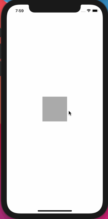
In the simplest case you need to rotate the component around a custom anchor point that is only different in x- and y-position, e.g. the corner of the component. The anchor point only needs to be specified in 2D. Still you can apply of course 3D rotations using this anchor point.
In the default case the component will rotate around its center. With the following trick you can rotate it around any point. The following steps show an example for rotating around the top-left corner of a square view with width and height 100. All the steps can be also seen visually in the image below.
- In the starting position, the component's anchor point is the center point of the View at (50; 50).
- Since the rotation shall rotate around the top left corner at (0; 0) in the View's coordinate system, the View is translated in such a way that the desired anchor point is in the position of the original anchor point (50; 50).
- In x direction the component needs to be translated by tx = 50 - 0. 50 is half of the width of the component and 0 is the x-coordinate of the desired anchor point (top left corner).
- In y direction the component needs to be translated by ty = 50 - 0. 50 is here half of the height of the component, which is the y-coordinate of the original anchor point. 0 is the y-coordinate of the desired anchor (top left corner).
- In the third step the rotation is applied to the component. In this case it is a counterclockwise rotation by a few degrees. The transform origin for the transformation is at the position of the original anchor point, which is now where the top left corner is.
- In the last step the translation needs to be undone, which means the View is simply tranlsated back by (-50; -50).
Voilà! The component is rotated around a custom anchor point.

Implementation
How does that look like in code?
Translations and rotations are implemented in the style property using transform. transform takes an array of transformation objects. Here the four translations (two translations in x- and two translations in y-direction) are implemented as well as the rotation in between. The following snippet shows a square component with size 50. The original anchor point is calculated using the squareSize variable.
const RotatedSquare = () => {
  const squareSize = 50;
  const anchorPointX = 0;
  const anchorPointY = 0;

  const squareStyle = {
    height: squareSize,
    width: squareSize,
    backgroundColor: '#00FFFF',
  };

  return (
    <View
      style={[
        squareStyle,
        {
          transform: [
            {translateX: anchorPointX - squareSize / 2},
            {translateY: anchorPointY - squareSize / 2},
            {rotateZ: '-30deg'},
            {translateX: -(anchorPointX - squareSize / 2)},
            {translateY: -(anchorPointY - squareSize / 2)},
          ],
        },
      ]}
    />
  );
};
The full source code for this chapter can be found here on Github.
Take Care Of The Transform Order
In the four steps I explained that first the component needs to be shifted by the x- and y-distance between the original anchor point minus the target anchor point. In the snippet above this is -(anchorPointX - squareSize / 2) which is -(0 - (50 / 2)) = -25. You may wonder why this translation is at the end of the transform array and not in the beginning.
A look at the React Native implementation of Stylesheet (processTransform on Github) shows the reason. Every transform is expressed as a 4x4 transformation matrix and all transformations are multiplied into one final transformation matrix.
In matrix calculus multiplications are processed "from right to left" which means that the transforms in the source code are applied in the reverse order. That means that the transform object which is listed last in the array is applied first. This is very important if you e.g. apply 3D transformations and want to apply perspective on that.
Reusable TransformOrigin Function
The transform origin functionality can be put into a function and then be reused in multiple components.
The transformOrigin function takes the destination anchor point, the original anchor point (center of the component) and the transforms that should be applied. This can be an array of multiple transform objects, in this case it contains only the rotation.
interface Point2D {
  x: number;
  y: number;
}

const transformOrigin = (
  anchorPoint: Point2D,
  originalCenterPoint: Point2D,
  transforms,
) => {
  const result = [
    {translateX: anchorPoint.x - originalCenterPoint.x},
    {translateY: anchorPoint.y - originalCenterPoint.y},
    ...transforms,
    {translateX: -(anchorPoint.x - originalCenterPoint.x)},
    {translateY: -(anchorPoint.y - originalCenterPoint.y)},
  ];
  return result;
};
Usage inside the component:
const RotatedSquareTransformOriginFunction = () => {
  ...
  const targetAnchorPoint: Point2D = {x: 0, y: 0};
  const originalAnchorPoint: Point2D = {x: squareSize / 2, y: squareSize / 2};

  return (
    <View
      style={[
        squareStyle,
        {
          transform: transformOrigin(targetAnchorPoint, originalAnchorPoint, [
            {rotateZ: '-30deg'},
          ]),
        },
      ]}
    />
  );
};
The full source code for this chapter can be found here on Github.
Implementation For Unknown Component Dimensions
In the example above, it was obvious that the component's center point is the center of the square and also the size of the square was known. In the regular case the size of the component is not known because layout with flexbox is used or the content of the component is dynamic because it contains text.
In this case the transform origin function can be used in combination with onLayout to measure the dimensions of the component as soon as it is mounted.
The dimensions need to be put into the state of the component and can be set to zero initially. In the onLayout event the state is updated with the measured with and height, which are then used in the transform origin function to calculate the center of the component which is the default anchor point.
In this example the component is a Text component with unknown width and length. The text is rotated around the top left corner of the component (0; 0):
const RotatedComponentOnLayout = () => {
  const [componentDimensions, setComponentDimensions] = useState({
    width: 0,
    height: 0,
  });

  const targetAnchorPoint: Point2D = {x: 0, y: 0};
  const originalAnchorPoint: Point2D = {
    x: componentDimensions.width / 2,
    y: componentDimensions.height / 2,
  };

  return (
    <Text
      onLayout={event => {
        const {width, height} = event.nativeEvent.layout;
        setComponentDimensions({width: width, height: height});
      }}
      style={{
        padding: 12,
        backgroundColor: '#00FFFF',
        transform: transformOrigin(targetAnchorPoint, originalAnchorPoint, [
          {rotateZ: '-30deg'},
        ]),
      }}>
      Some Text
    </Text>
  );
};
The full source code for this chapter can be found here on Github.
Make It Animated
The custom transform origin can also be animated. I am using the React Native Reanimated 2 library.
First a Shared Value "animatedValue" is created. The Shared Value is similar to the concept of Animated.Values from the Animated API. The attribute Shared means that this value is shared between the UI and the JS thread which allows the animation to be driven in the native thread.
The Shared Value will be animated from value 0 to 1 and is then interpolated to degree/radians from 0 to 360 degrees.
The main difference to the non-animated case is that the transform origin function needs to be converted to a worklet. The "worklet" directive is added at the top of the function:
const transformOriginWorklet = (
  anchorPoint: Point2D,
  originalCenterPoint: Point2D,
  transforms,
) => {
  'worklet';
  const result = [
    {translateX: anchorPoint.x - originalCenterPoint.x},
    {translateY: anchorPoint.y - originalCenterPoint.y},
    ...transforms,
    {translateX: -(anchorPoint.x - originalCenterPoint.x)},
    {translateY: -(anchorPoint.y - originalCenterPoint.y)},
  ];
  return result;
};
After that the worklet transformOriginWorklet can be simply used in the useAnimatedStyle in order to calculate the style property including the transformation and rotation. Here the interpolation of the shared value to the range 0..2 PI is done.
  const animatedStyleZ1 = useAnimatedStyle(() => {
    const degree = interpolate(animatedValue.value, [0, 1], [0, 2 * Math.PI]);
    return {
      transform: transformOriginWorklet(
        {x: squareSize, y: squareSize},
        {x: squareSize / 2.0, y: squareSize / 2.0},
        [{rotateZ: degree}],
      ),
    };
  });
The style attribute is afterwards on the Animated.View that shall be rotated.
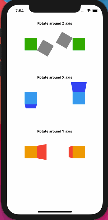
<Animated.View style={[squareStyle, animatedStyleZ1]} />This screen shows a demo of the animated Views that are rotated around different anchor points and also around different axes.
Applying Perspective
In the demo screen above, the 3D effect can be clearly seen in the rotations around the x- and y-axis. This is only visible when applying "perspective" to the components. This applies a camera project to the 3D View's which leads to near points appearing bigger and far points smaller. The order of the transforms is also important here. The perspective needs to be applied in the last step, which means that it needs to be in the first place of the array of transform objects.
  const animatedStyleX1 = useAnimatedStyle(() => {
    const degree = interpolate(animatedValue.value, [0, 1], [0, 2 * Math.PI]);
    return {
      transform: [
        {perspective: 200},
        ...transformOriginWorklet(
          {x: squareSize, y: squareSize},
          {x: squareSize / 2.0, y: squareSize / 2.0},
          [{rotateX: degree}],
        ),
      ],
    };
  });
The full source code for this chapter can be found here on Github.
Anchor Point in z-Direction
All the explanations above did not show how to set a custom transform origin in three dimensions, including a z-translation. Up to now only x- and y-coordinates of the anchor point were specified. There is a good reason for that: the transform property in React Native does not support a translateZ feature.
However, the matrix property is supported and with some math knowledge you can simply implement and use the translateZ feature by your own.
Affine Transformations
Translation And Rotation Operations
In vector algebra a translation is normally represented as a vector addition, e.g.:

Rotations are represented as matrix multiplications. Basic rotations around x, y and z axis can be found here on Wikipedia. E.g. the 3x3 rotation matrix around the x axis is:

Rotating a vector x by 30 degree around the x axis looks like the following:

Affine Maps
Now what is a so called affine map? An affine map f(x) is the composition of a translation and a linear map (e.g. a rotation is also a linear map):

The good thing about this is that with a simple trick it is possible to express these two operations in a single matrix multiplication. This brings the advantage that you can simply express many transformations (multiple translations and multiple rotations) also in a single transformation matrix. Also React Native uses transformation matrices internally for all transformations.
The key to express the affine map in one matrix is using an augmented matrix and an augmented input.
An augmented matrix and augmented vector are obtained by appending a "1" to the vector and appending a row of zeros to the matrix as well as appending an extra column with the translation vector to the matrix.
In this example before the augmentation the input is 3x1 vector [1 2 3]. The input vector is rotated with a 3x3 matrix and then translated by adding a 3x1 vector [4 5 6]. The output is a 3x1 vector.

After the augmentation of this affine map, there is only one 4x4 transformation matrix applying the rotation and translation by multiplication. As you can see also the output is now a 4x1 vector where the last row containing "1" can be neglected.

This augmented matrix expression is equivalent to the initial representation as:
If you want to follow this in more details, you can jump to the two chapters on Wikipedia:
3D Anchor Points
Knowing about the augmented matrix representation the transformOrigin function before can be re-implemented using the matrix transform property. Now the anchor point can be defined also on the z-axis as showing in the following image. Here the anchor point is at (0; 0; 50).

Rewriting the transformOrigin function involves the following steps:
- The translations simply have to be put in the last column vector of a 4x4 transformation matrix instead of using the translateX transform-property.
- The rotations need to be written in the first 3x3 rows and columns of the 4x4 transformation matrix instead of using the rotate transform-property.
- The sequence of translations and rotations can be multiplied into one 4x4 matrix. Injecting the desired rotation now also works by multiplying the matrices.
Luckily, in React Native there is already a utility-library that defines a MatrixMath module. The MatrixMath module already defines a 4x4 matrix by an array with 16 elements and provides a lot of operations and helper functions for working with matrices:
import MatrixMath from 'react-native/Libraries/Utilities/MatrixMath';The module has several useful functions, so it's not necessary to re-implement rotation matrices or matrix multiplications again. The following functions will be used:
createIdentityMatrix: Create an identity matrix (1s on the matrix diagonal)reuseTranslate3dCommand: insert a translation in x, y and z in the last column of the matrixreuseRotateXCommand: Fill the first 3x3 rows and columns of a matrix with rotation matrix around the x axis.reuseRotateYCommand: Fill the first 3x3 rows and columns of a matrix with rotation matrix around the y axis.reuseRotateZCommand: Fill the first 3x3 rows and columns of a matrix with rotation matrix around the z axis.multiplyInto: Multiply two matrices a and b into a result transformation matrix.
First the anchor point interface is changed to a 3D Point. Second the transformation to be applied is input as a 4x4 matrix.
The first translation and translation back are implemented as matrices using the reuseTranslate3dCommand function. The translations and original transformation matrix are multiplied together. Take care of the order of matrices since matrix multiplications are not commutative.
interface Point3D {
  x: number;
  y: number;
  z: number;
}

/* this function directly modifies the transformMatrix */
const transformWithOrigin = (
  transformMatrix: Array<number>,
  origin: Point3D,
) => {
  const {x, y, z} = origin;
  const translateToOrigin = MatrixMath.createIdentityMatrix();
  MatrixMath.reuseTranslate3dCommand(translateToOrigin, -x, -y, -z);
  MatrixMath.multiplyInto(transformMatrix, translateToOrigin, transformMatrix);
  const translateBack = MatrixMath.createIdentityMatrix();
  MatrixMath.reuseTranslate3dCommand(translateBack, x, y, z);
  MatrixMath.multiplyInto(transformMatrix, transformMatrix, translateBack);
};
For using the function for rotation around an anchor point at (0; 0; 50) by 30 degree, first create a rotation matrix around X using reuseRotateXCommand. Afterwards modify the transformation matrix with the transformWithOrigin function. The created matrix is put in the style transform property of the View. Also perspective is applied to see the effect. The perspective element has to be in the first place in the transform array:
const anchorPointXYZ = {
x: 0,
y: 0,
z: 50,
};
let rotX = MatrixMath.createIdentityMatrix();
MatrixMath.reuseRotateXCommand(rotX, degreeToRad(30));
transformWithOrigin(rotX, anchorPointXYZ);
...
// apply the rotation matrix and perspective
<View
style={[
squareStyle,
{ transform: [{perspective: 1000}, {matrix: rotX}], },
]}
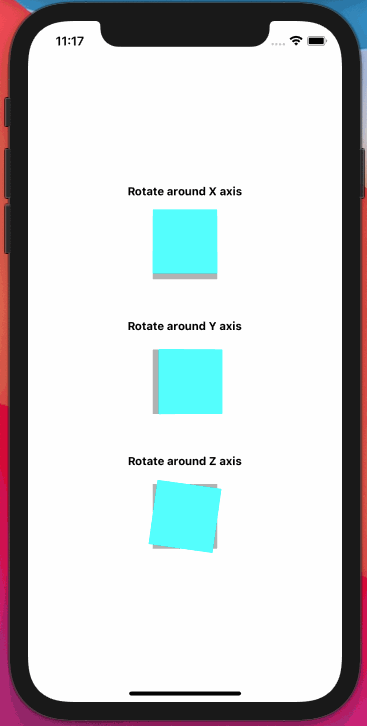
/>This screen shows example rotations around x, y and z with the anchor point at (0; 0; 50). The grey squares are the original square Views. The blue squares are rotated by 30 degree around the respective axes.

The full source code for this chapter can be found here on Github.
Animate It
In order to use animate transformations using a 3D anchor point and React Native Reanimated 2 the transformWithOrigin function needs to be converted to a worklet so that it can run on a separate JS thread. Since transformWithOrigin also uses the MatrixMath functions they also need to be converted to "worklet"-functions. For that they are simply copied out of the original module into a separate file and the "worklet" keywords are included. For example:
export const createIdentityMatrix = () => {
  'worklet';
  return [1, 0, 0, 0, 0, 1, 0, 0, 0, 0, 1, 0, 0, 0, 0, 1];
};
...
Now transformWithOrigin can be used in the useAnimatedStyle hook from Reanimated 2. In this case a rotation around the x-axis is animated with an anchor point which is at (0; 0; 50). A shared value is driven from 0..1 and interpolated from 0..2 PI so that the View is endlessly rotated:
 const animatedStyleX = useAnimatedStyle(() => {
   const degree = interpolate(animatedValue.value, [0, 1], [0, 2 * Math.PI]);
   let rotX = createIdentityMatrix();
   reuseRotateXCommand(rotX, degree);
   transformWithOrigin(rotX, anchorPointXYZ);
   return {
     transform: [{perspective: 1000}, {matrix: rotX}],
   };
 });
The animation shows also examples of rotating around the y- and z-axis with the anchor point at (0; 0; 50). The grey squares are simply static non-rotated Views. The blue ones are rotated around the custom 3D anchor point.
The full source code for this chapter can be found here on Github.
Implement A 3D Cube in React Native
The transformWithOrigin can be now easily used to implement a 3D cube that can be rotated using a PanGestureHandler.
The cube consists of 6 square Views that are all rotated around the center point of the cube. The concept is to define the 4 surfaces at the front, left, right and back as Views that are rotated by 0, -90, 180 and 90 degree around the 3D center point of the cube which is the anchor point for the rotations. The bottom and top surface are rotated by -90 and 90 degree around the x-axis around the 3D center point.
The surfaces have a height and width of 100. Therefore the center of the cube is defined at (0; 0; 50) which is the center in x- and y-direction of the front and shifted by half of size of the squares in z-direction.
To control the cube with gestures first two shared values are defined that hold the PanGestureHandler translation values in x- and y-direction. The values are divided by 50 to have a slower rotation of the cube and it's less sensitive to the gesture. y is also multiplied with minus 1 so that moving upwards results in a positive y value.
const use2DSharedVector = () => {
  const x = useSharedValue(0);
  const y = useSharedValue(0);
  return {x, y};
};

const CubeScreen = () => {
  const vectorFront = use2DSharedVector();
  const originCube = {
    x: 0,
    y: 0,
    z: 50,
  };

  const onGestureEvent =
    useAnimatedGestureHandler<PanGestureHandlerGestureEvent>({
      onStart: () => {},
      onActive: ({translationX, translationY}) => {
        vectorFront.x.value = translationX / 50.0;
        vectorFront.y.value = -translationY / 50.0;
      },
      onEnd: () => {},
    });

...
In the next step 6 different animated styles for the 6 surfaces need to be created using the useAnimatedStyle hook. For the front surface the x- and y-translation of the gesture handler are simply put into the y- and x-rotation of the surface. That means when the gesture goes to the right (positive x-direction), the surface is rotated around the y-axis. When moving upwards (positive y-translation value) the surface is rotated around the x-axis. For having multiple rotations in one function I implemented the rotateXYZ worklet which returns an XYZ-rotation matrix.
For the left surface the style is computed in the same way as the front surface, but 90 degree are always subtracted from the y-rotation. For the right surface 90 degree are added. For the back surface 180 degree are added to the y-rotation:
  const animatedStyleFront = useAnimatedStyle(() => {
    const rotationMatrix = rotateXYZ(
      vectorFront.y.value,
      vectorFront.x.value,
      0,
    );
    transformWithOrigin(rotationMatrix, originCube);
    return {
      transform: [{perspective: 1000}, {matrix: rotationMatrix}],
    };
  });

  const animatedStyleLeft = useAnimatedStyle(() => {
    const rotationMatrix = rotateXYZ(
      vectorFront.y.value,
      vectorFront.x.value - Math.PI / 2.0, // -90 degree for the left surface of the cube
      0,
    );
    transformWithOrigin(rotationMatrix, originCube);
    return {
      transform: [{perspective: 1000}, {matrix: rotationMatrix}],
    };
  });

...
For the top and bottom surface of the cube it is slightly different. The top and bottom surface must be rotated around the y-axis when the gesture is happening in the x-direction. When the gesture is moving upwards the (y-translation value), the surface needs to be rotated around the x-axis. For the top 90 degrees are always added to the x-rotation. For the bottom 90 degrees are always subtracted.
const animatedStyleTop = useAnimatedStyle(() => {
  const rotationMatrix = rotateXYZ(
    vectorFront.y.value + Math.PI / 2.0, // +90 degree for the top surface of the cube
    0,
    -vectorFront.x.value,
  );
  transformWithOrigin(rotationMatrix, originCube);
  return {
    transform: [{perspective: 1000}, {matrix: rotationMatrix}],
  };
});
After calculating the 6 styles for the 6 surfaces, they simply have to be applied to 6 Animated.Views. Here the examples for the front, left and right surface are shown. The surfaces also need to be positioned 'absolute' so they are not positioned after each other in a row or column:
<Animated.View style={[styles.square, animatedStyleFront]} />
<Animated.View
  style={[
    styles.square,
    animatedStyleLeft,
    {backgroundColor: 'rgba(255, 0, 0, 0.5)'},
  ]}
/>
<Animated.View
  style={[
    styles.square,
    animatedStyleRight,
    {backgroundColor: 'rgba(0, 255, 0, 0.5)'},
  ]}
/>
The full source code for the cube implementation can be found here on Github.